Introduction
Maps allows us to display information about sampling locations and experimental design. Often times, maps are overcrowded, the fonts are too small, or the symbols are difficult to differentiate between. Creating a map that is easily understood is essential for others to understand our research. QGIS is my go-to mapping program because it’s available for most operating systems, it’s open-source,and it’s easy to manipulate the maps you create. With just a few clicks, you’ll have a simple, beautiful map that displays your data in a graphically pleasing way. Popular, alternative tools for mapping include the package ggplot2 in R, ArcGIS, and Surfer.
Terminology
- Spatial data: the geographic location of features and boundaries
- Vector data: a type of spatial data that uses vertices and paths; this type of data is useful for features that are not changing such as topology
- Vector points: XY coordinates, usually a latitude and a longitude
- Vector lines: represent linear features such as roads and rivers; they are constructed by connecting points with paths
- Vector polygons: show boundaries and are constructed when a set of points connected with paths is closed
- Raster data: a type of spatial data that uses pixels; this type of data is useful for features that frequently change such as rainfall and temperature
- Attribute data: descriptive data of geographic features; examples - site type, site name, and depth
- Shapefile: file format that allows you to store the location and attribute information of geographic features
- Symbology: a layer’s visual appearance on a map
Getting Setup
Click on the logo above to go to the QGIS website where you can download the software.
Download the files used in this guide here
Additional files for mapping can be downloaded from the natural earth.
Making a Map
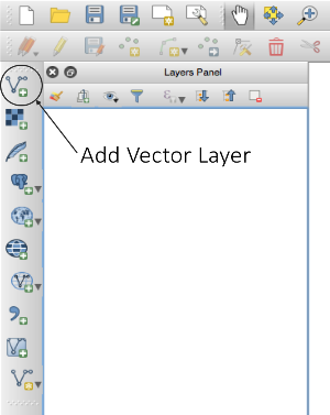
1) Open QGIS and click the add vector layer icon.
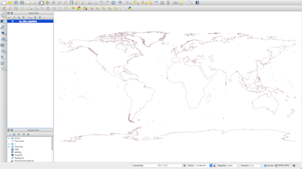
2) Open the ne_10m_coastline.shp file. The file will load into the viewing panel and should like this:
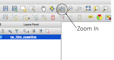
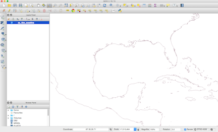
3) Zoom into the Gulf of Mexico region by selecting the zoom in icon and drawing a box around the region.
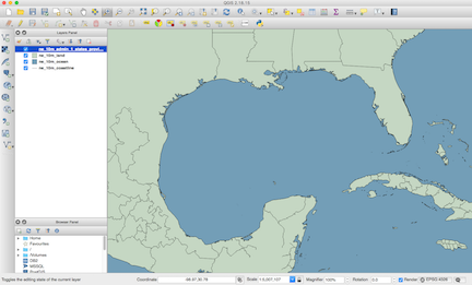
4) Click the add vector layer icon and open the ne_10m_admin1_states_provinces_lines.shp file, the ne_10m_land.shp file, and the ne_10m_ocean.shp file. This map should appear in the viewing panel:
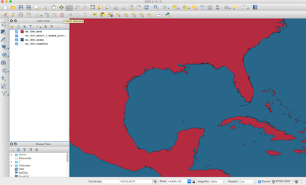
That’s not a very pretty map… but also the state lines aren’t showing up. This is because the layers are in the incorrect order. The map builds from the bottom layer up.
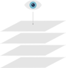
For this map, the first layer is the coastline shapefile. The next layer is the ocean shapefile, then the state line shapefile, and the land shapefile. Since the land shapefile is on top of the state lines shapefile, the state lines don’t appear on the map. This can be fixed by reordering the layers.
5) Reorder the layers by clicking on the land layer and dragging it below the stateline layer.
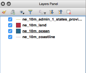
The state lines should be visible on the map. Now to make it prettier.
6) Right click on the coastline layer and select ‘Properties.’ This will open a dialog window that looks like this:
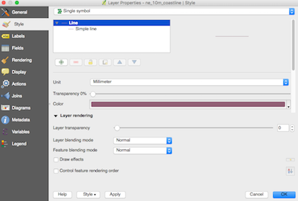
Change the color to black and click OK. Repeat process with the other layers to change their colors. You should now have a map that looks more graphically appealling.
7) Up till now, we’ve only used vector files. To add bathymetry, we’re going to use a raster file. To add a raster file, click on the add raster layer icon (the icon directly beneath the add vector layer icon) and open the file bathymetry_rasterfile. A dialog box will open. Make sure that WGS84 is selected as the Coordinate Reference System and click OK. Your map will now look like this:
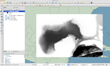
Not exactly what we want…
8) The bathymetry layer is covering part of the land layer. To make the land layer visible again, reorganize the layers by dragging the bathymetry layer below the land layer.
9) To recolor the bathymetry layer, right click the raster layer and select ‘Properties.’ Under ‘Render type’ select ‘Singleband pseudocolor.’ Under ‘Color’ select ‘PuBu’, check mark ‘Invert’, and Edit the color scheme so that the first color is similar to the second or third color. Click ‘OK’. The resulting map should look like this:
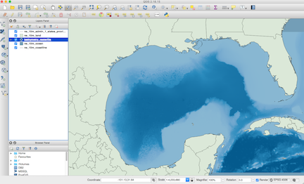
Beautiful!
10) We have an aesthetically pleasing map but no data displayed on it. To add points to the map, we’re going to create a .csv file using Microsoft Excel. Type the following data into a workbook:
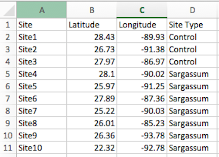
Save the file as a .csv file.
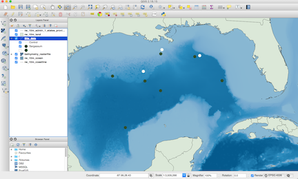
11) To load the site data into the software, select the ‘Add Delimited Text Layer’ icon (the third icon from the bottom of the sidebar). Select the file to upload and select csv as the file format. The options for ‘Geometry definition’ should load automatically with X field as Longitude and Y field as Latitude. Click ok. A new dialog box will open. Make sure that WGS84 is selected as the Coordinate Reference System and click ok. The map should look like this:

12) The sites appear as tiny green dots on the map that are extremely hard to see. Let’s fix that! Right click on the site data layer and select ‘Properties.’ Under ‘marker’ select ‘categorized.’ For column, select ‘Site Type.’ For ‘Symbol’ click ‘change’. In the new dialog box select simple marker. Change the fill to black and under outline, select transparent border. Scroll down in the dialog box to size and change it to 5.5 millimeters. Select ok. In the remaining dialog box for ‘Color ramp’ select greens. Click ‘classify’ and the site types with their colors will appear. Adjust colors as desired by right clicking on they symbols. When you are happy with the settings, click ‘OK’.
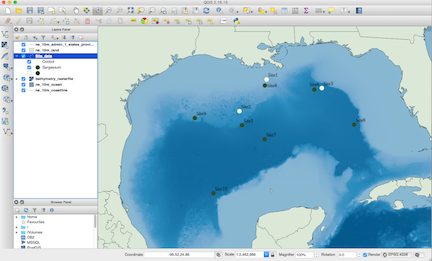
13) Let’s add label the points! Right click on the site data layer and select ‘Properties’. In the dialog box, select ‘Labels’. Select ‘show labels for this layer’. Click on ‘label with’ and select Site. Adjust the font settings to your liking and click ‘OK’.
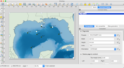
14) Now we’re ready to add the final touches to our map. Click on the ‘New Print Composer’ icon (4th icon to the left of the zoom in icon). Name the workspace SiteMap and click ‘OK’. A new dialog box will open.

15) Click on the “Add new map” icon (the 6th icon from the top on the sidebar) and draw a box on top of the white canvas. Your map from the other window should appear.
16) Add a legend to your map by clicking the ‘Add new legend’ icon (the 5th icon from the bottom of the sidebar). Draw a rectangle where you would like the legend to appear on your map. Adjust the legend properties by clicking ‘Item Properties’ in the right bottom panel. Change the Title to ‘Site Type’ and change the alignment to ‘Center’. To change what appears in the legend, unselect ‘autoupdate’ in the ‘Legend items’ box. Click on the items you want to remove and click the red minus sign.
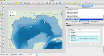
17) You can continue to further customize your map in the print composer dialog box or save it by exporting image (8th icon on the topbar).
18) Save your project as a .qgs file by going back to the main QGIS program window and clicking on the ‘Save’ icon (the third icon in the topbar).
